Do you want to change the look and feel of the post edit screen when creating WordPress posts?
WordPress comes with an intuitive content editor, with different sections and toolbars. To reduce distraction, you may want to hide the areas that you don’t use.
In this article, we’ll show you how to rearrange the post edit screen in WordPress.
Rearrange WordPress Post Edit Screen
By default, the WordPress block editor offers a sleek user experience. However, as you get used to it, you’ll notice that you use some areas more than others.
There are a few built-in options that you can use to customize the post editor to your own liking.
Here’s what the standard editor looks like:
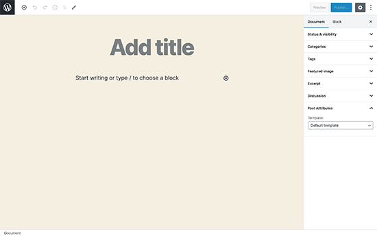
On the right, you have your document settings and block settings, which show up when you click on any block on your post.
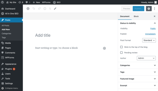
If you have been using WordPress for a while, then your default editor view may also include the WordPress admin sidebar.
If you don’t see it, then there’s an option to view the admin sidebar by switching off the full-screen mode (we’ll show you how later in this article).
Show / Hide Panels in WordPress Post Editor
What if you want to hide some of the panels in the WordPress content editor? Let’s say you want to get rid of the categories, tags, featured images, and excerpts?
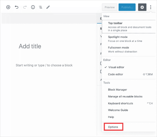
First, you’ll need to click on the 3 dots menu in the upper right corner and then select ‘Options’ from the menu.
This will bring up a popup with a list of panels that you can show or hide.
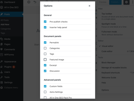
Now you can check or uncheck any of the boxes you want to be displayed in the right panel.
This is helpful if you’re not using certain panels very often.
Stick Block Toolbar to the Top
When you are working on a block, the editor shows a block toolbar right above it. The toolbar is displayed as you move between blocks.
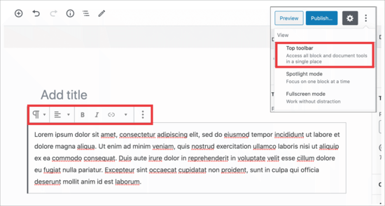
If you find the toolbar to be distracting, then you can move it to the top.
To do this, you’ll want to click on the 3 dots in the upper right corner and then you’ll see the ‘Top toolbar’ option.
Clicking on it will move the block toolbar to the top making your blocks less distracting.
Here’s how it would look:
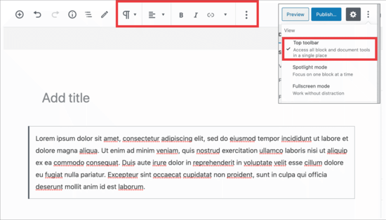
This setting can make it easier to edit each block when you are working on complex layouts with columns, groups, and tables.
Bonus: See our list of the best Gutenberg block plugins to get the most out of the new block editor.
Remove Right Side Panel
Want to remove the panel on the right side, so you can focus on the content?
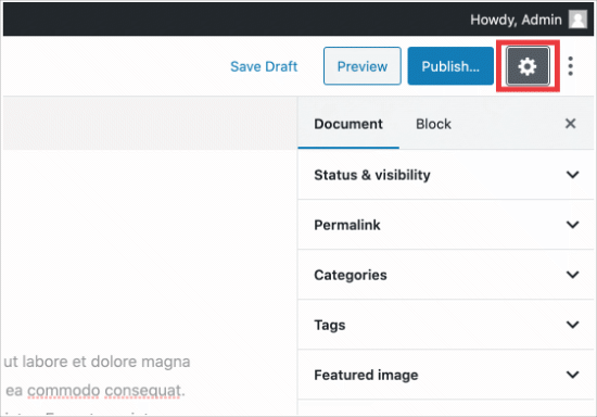
WordPress makes this super easy. Simply click on the gear icon at the top and the right column will disappear.
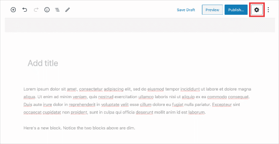
Clicking the gear again will display the right column, so you can use your document and block settings.
Using The Fullscreen Editor in WordPress
WordPress editor comes with a fullscreen editor that removes the WordPress admin sidebar and toolbar. You can enter the fullscreen editor or exit it any time you want.
All you need to do is click on the 3 dots menu in the upper right corner and then select ‘Fullscreen mode’ in the dropdown.
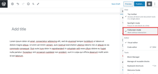
Repeat the same steps when you want to exit the fullscreen editor.
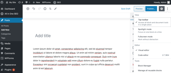
WordPress will remember your preference and next time it will open the post editor in the same view that you had selected.
For more on this, here’s how to disable the fullscreen editor in WordPress.
Use Spotlight Mode in Post Editor
By default WordPress uses the spotlight mode to highlight the block you have been working on. Basically, it just dims the opacity of other blocks, so you can focus and locate the block you are currently editing.
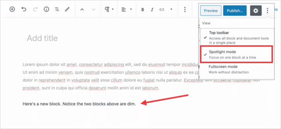
However, sometimes you want to see all your blocks together to get an idea of how they’ll look. You can turn off spotlight mode by simply clicking on the three dot menu icon and selecting ‘Spotlight Mode’.
Repeat the same steps when you want to turn it back on.
Collapse Document Panel Sections
The document panel in the right column shows all the standard WordPress settings for a post. Your WordPress plugins and themes may also add sections to this panel.
This would make the panel a bit longer and difficult to locate things.
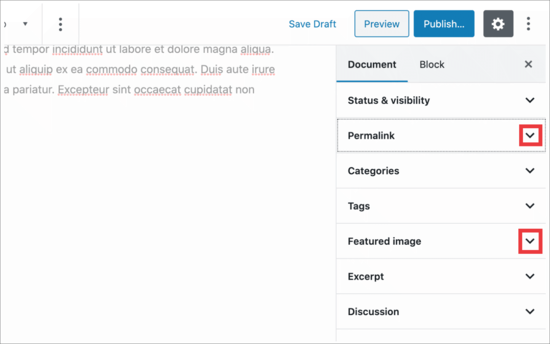
You can simply collapse document sections by clicking on the upward arrow next to each section.
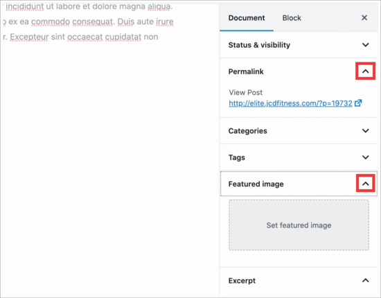
And when you click on the arrows, you’ll collapse them, making your document look much cleaner.
That’s all.
We hope this article helped you learn how to rearrange post edit screen in WordPress. You may also want to see these useful WordPress keyboard shortcuts to save time, and our guide on how to create members only content in WordPress.
If you liked this article, then please subscribe to our YouTube Channel for WordPress video tutorials. You can also find us on Twitter and Facebook.
The post How to Rearrange Post Edit Screen in WordPress appeared first on WPBeginner.
from WPBeginner https://ift.tt/36lEPAz
via IFTTT
No comments:
Post a Comment